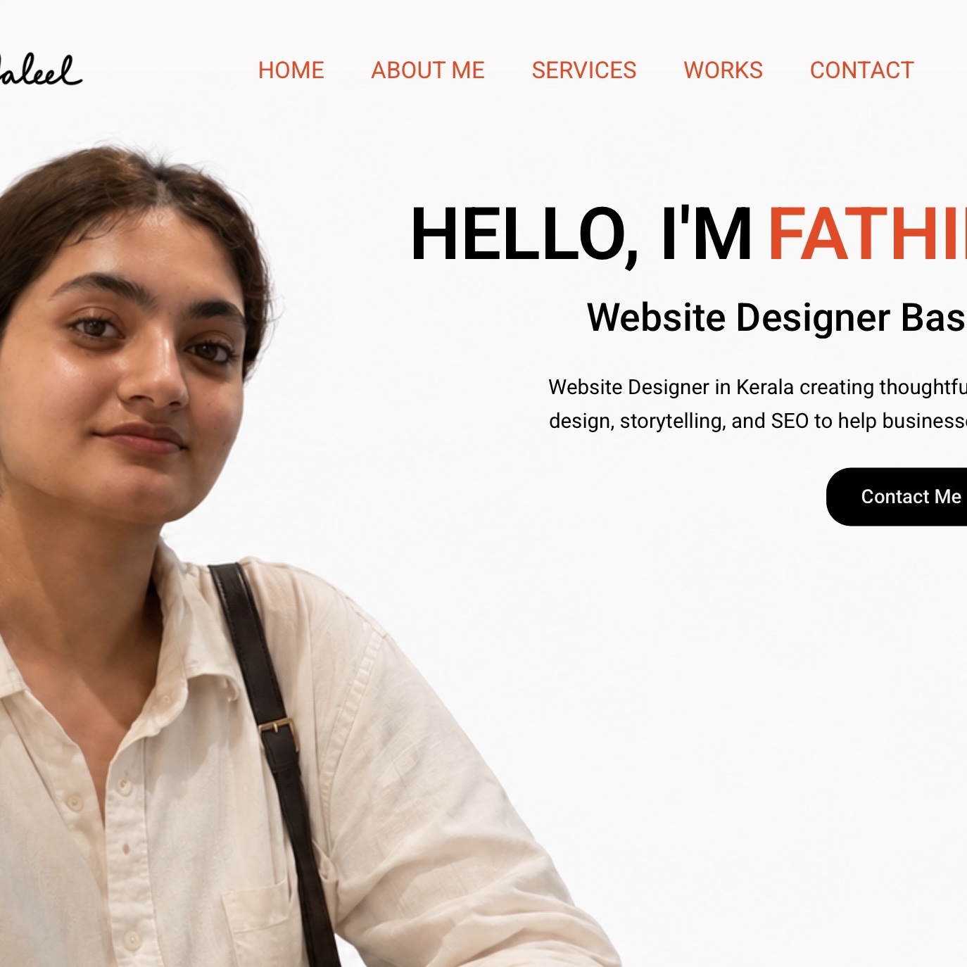
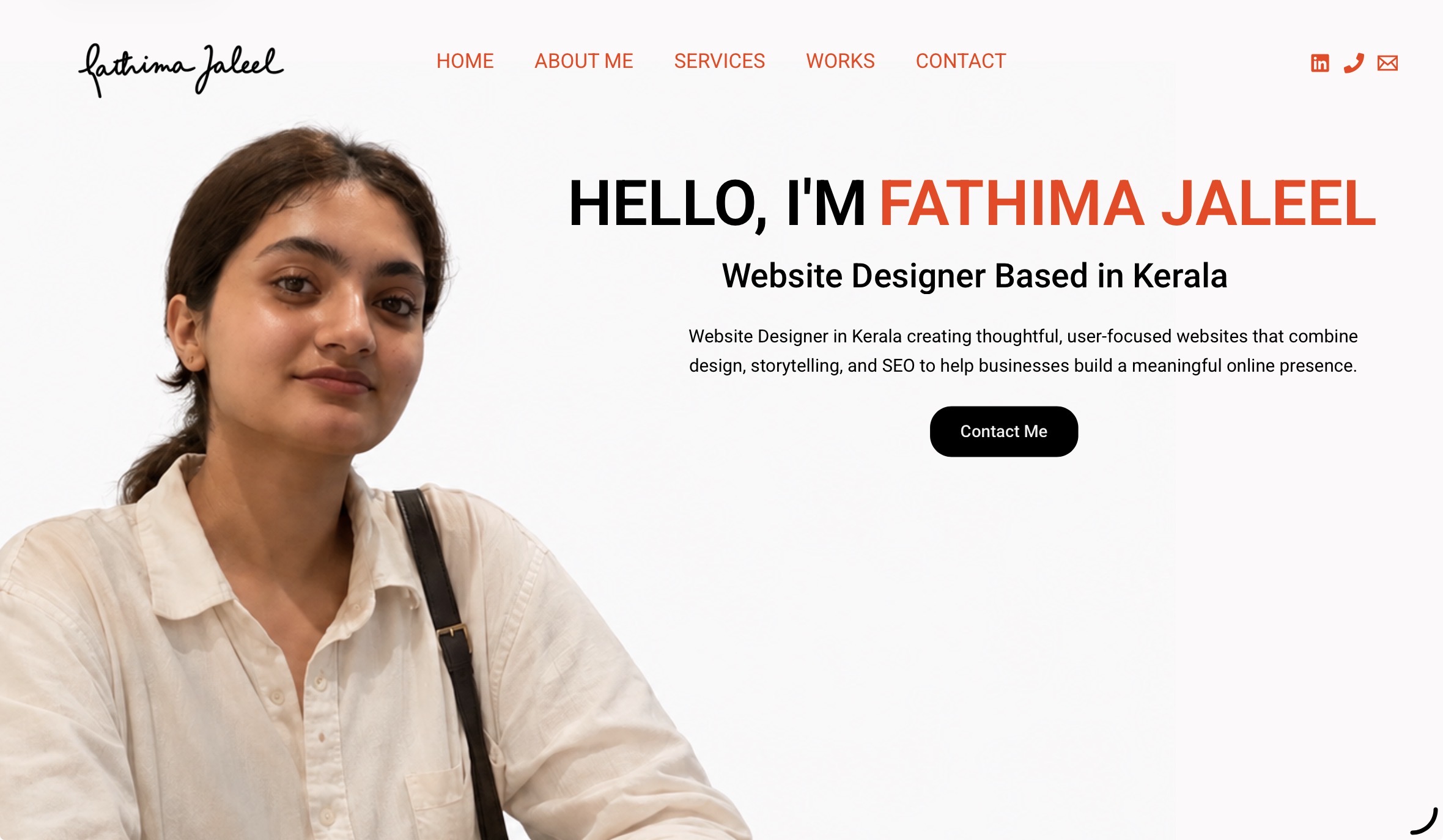
Homepage of Fathima Jaleel, Website Designer in Kerala

01

Designing My Digital Home

A personal portfolio website designed to showcase my journey, skills, and work through design and story telling.

Role

Designer & Developer

Created

June 2026 

Tools

WordPress, Elementor & Canva

Skills

Web Design, SEO, Content Writing

WHERE IT ALL BEGAN

This Portfolio was created to showcase not only my work, but also the way I think as a digital marketer. Every section was intentionally designed to tell my story while keeping the experience clean, engaging, and easy to navigate.

THE PROBLEM I WANTED TO SOLVE

How do you introduce yourself when you’re only just beginning your journey?

Without a long list of client projects or years of experience, I wanted to create a portfolio that focused on my thinking rather than just my achievements. My goal was to build a space that reflected my personality, showcased the skills I’ve developed so far, and could continue evolving as I grow in digital marketing.

MY GOALS

Tell my story

Showcase my skills

Build a memorable first impression

Practice web design

Learn by building

FINDING INSPIRATION

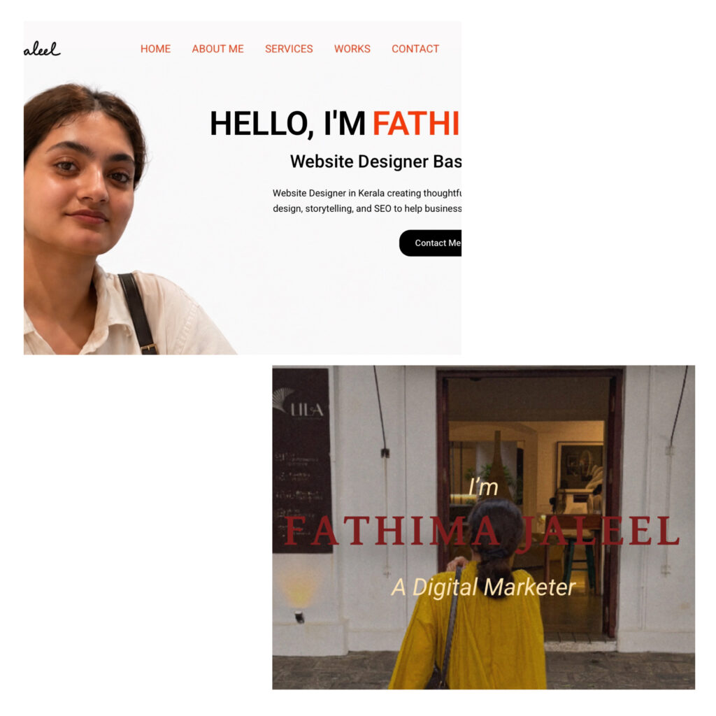
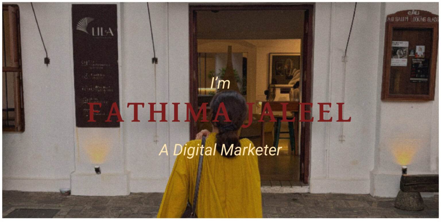
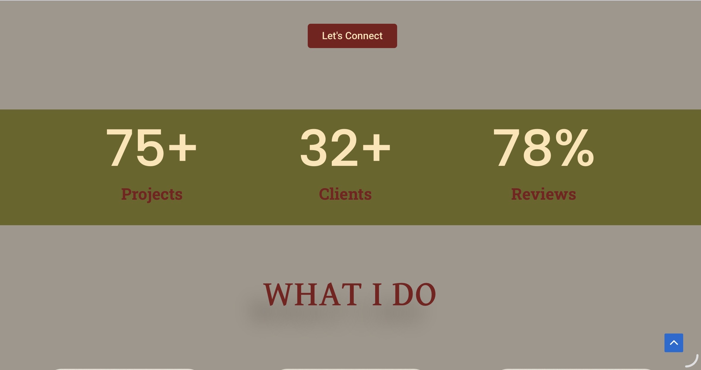
At the beginning of this project, I was honestly quite confused about what direction to take. I wanted my portfolio to feel professional, but I also wanted it to reflect my personality. Finding the right balance wasn’t as easy as I expected. My first idea was to create a website inspired by Indian aesthetics. I experimented with rich colours like maroon, deep green, and mustard yellow, paired with grainy imagery to give the website a nostalgic, editorial feel.

Initial hero section design for the portfolio website

My initial Indian-inspired hero section

Early layout concept for the portfolio website

While I loved the concept, the more I worked on it, the more I realised it felt visually heavy and overcrowded. It didn’t create the clean, welcoming experience I wanted visitors to have. That realisation completely changed my direction. I decided to embrace a brighter, more minimal design with plenty of white space, allowing the content to breathe while still reflecting my personality. Instead of trying to make the website stand out by adding more, I focused on making every element feel intentional.
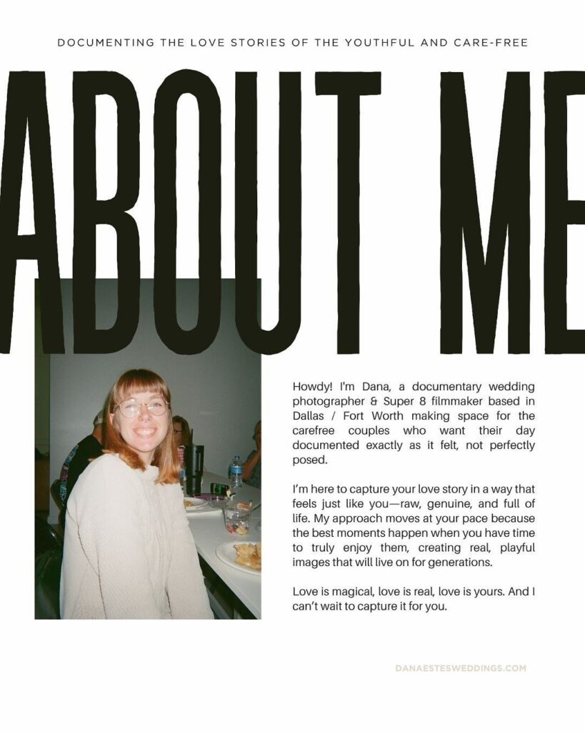
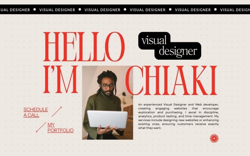
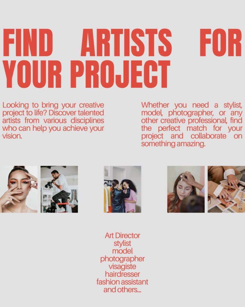
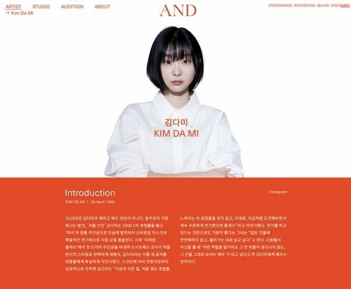
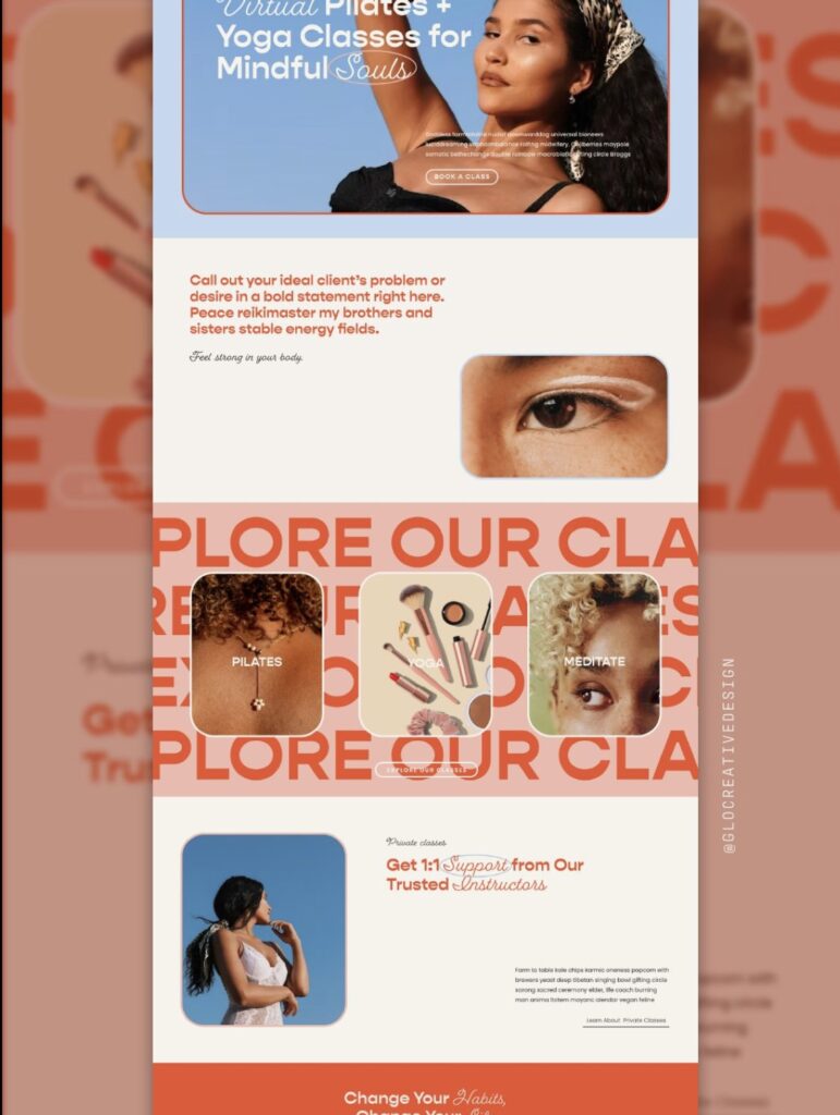
Pinterest became my biggest source of inspiration throughout the process. Whether I was choosing a colour palette, exploring typography, collecting layout ideas, or studying creative interactions, it was where almost every idea began.

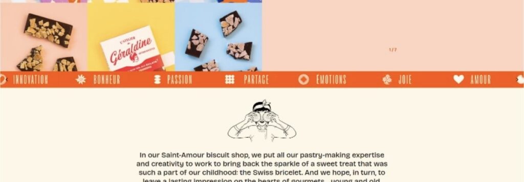
Portfolio layout inspiration
Website design inspiration for portfolio homepage
Modern website design inspiration
Color palette inspiration for portfolio
UI inspiration for portfolio website

My image references from Pinterest

Friends also recommended websites like Awwwards, and while I can definitely appreciate the incredible work showcased there, I found Pinterest much easier to navigate as someone still learning. It allowed me to gather inspiration quickly without feeling overwhelmed, making it the perfect starting point for this project.

BRINGING IT TO LIFE

Typography

Roboto Font

(Heading & Text Editor)

Manrope Font

(Text Editor)

I chose Roboto for the headings and Manrope body text because I wanted a typeface that felt clean, modern, and easy to read. It’s simple design perfectly complements the minimal direction of the website, creating a professional look without distracting from the content.

Colour Palette

Primary brand color for portfolio website

HEX #F53905

Secondary color selected for portfolio design

HEX #FFFFFF

Accent color used throughout the portfolio website

HEX #000000

A minimal colour palette of vibrant vermilion, black, and white was chosen to create a bold yet balanced visual identity. The accent colour adds personality, while the neutrals keep the overall experience clean and focused.

DESIGN DECISIONS

Minimal Hero

I chose a minimal hero section to create a strong first impression without overwhelming visitors. By keeping the layout clean and focused, the attention naturally stays on my introduction and the message I want people to remember.
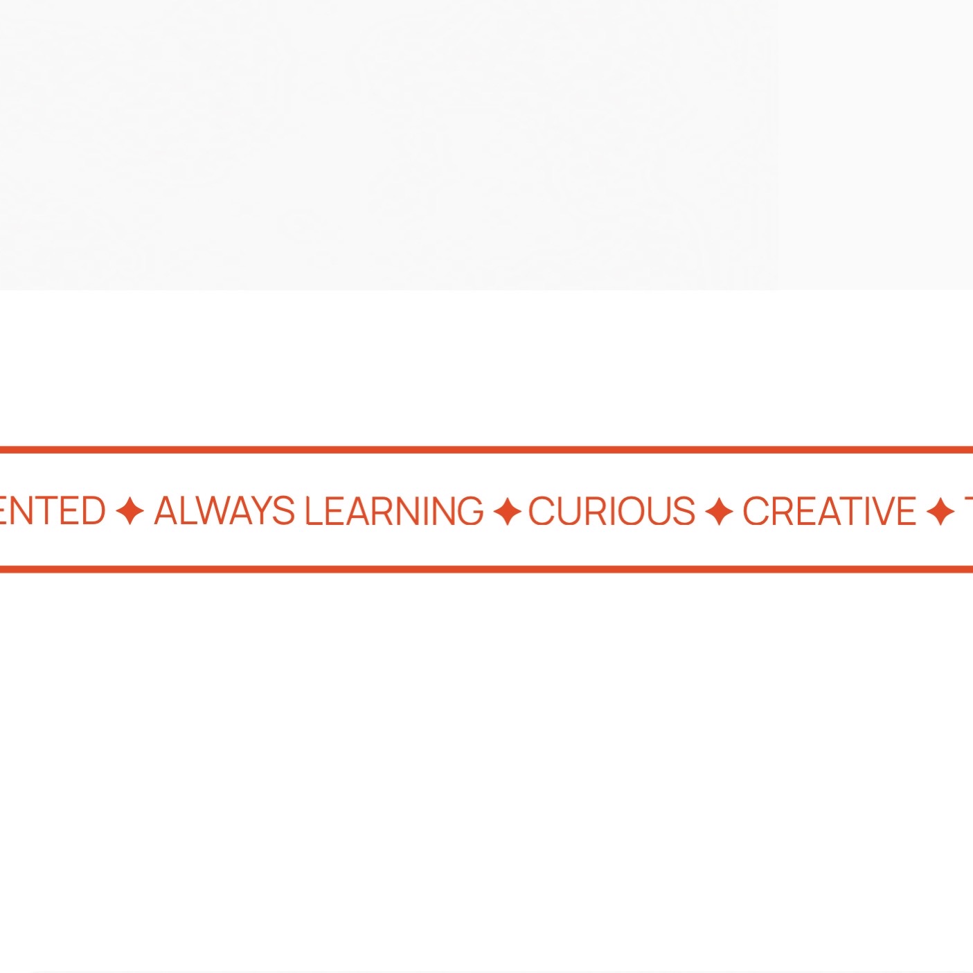
Marquee Section

I introduced a marquee section to add subtle movement and personality to the website. It reinforces my creative identity while creating a smooth visual transition between sections without distracting from the overall experience.
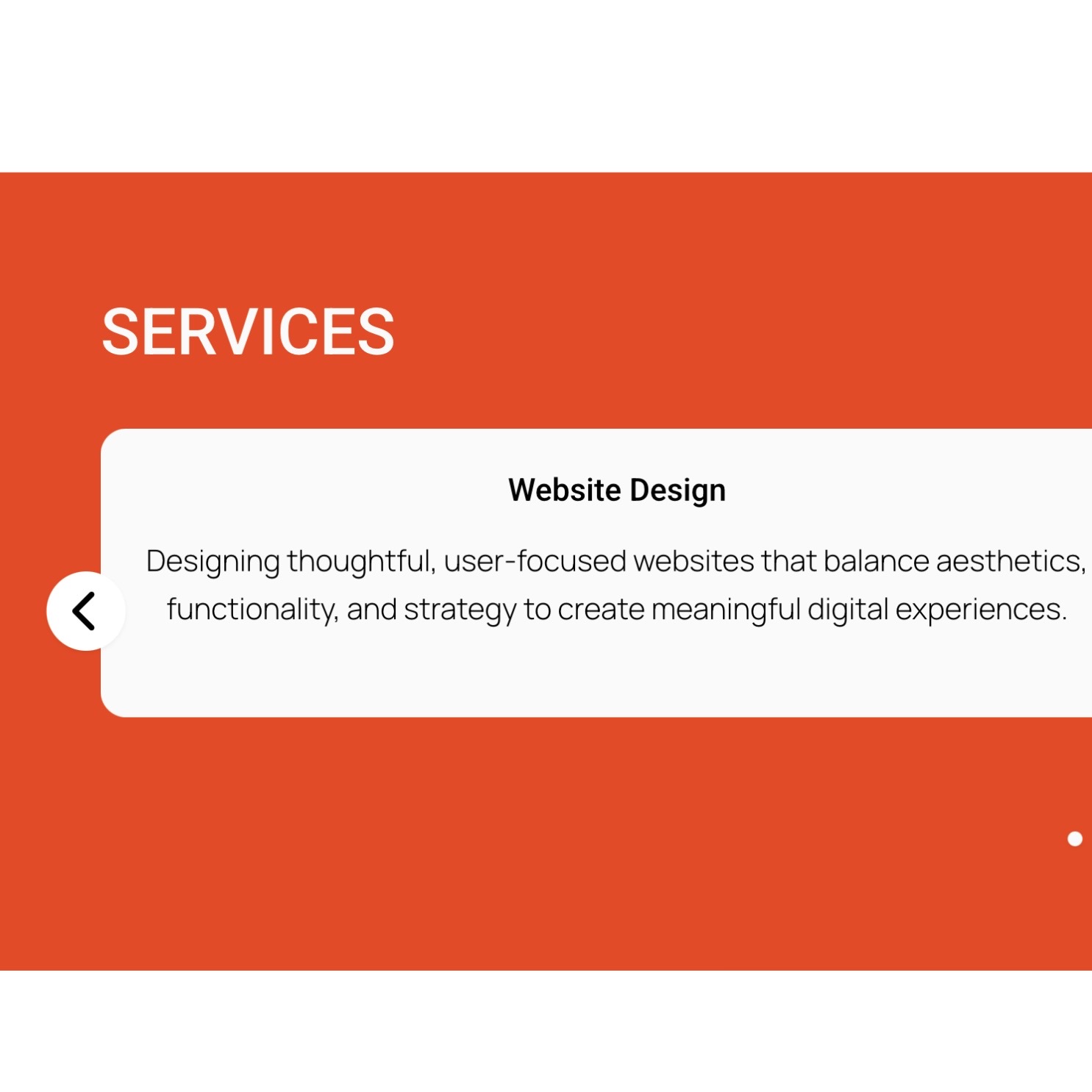
Text Carousel

Instead of displaying all my skills at once, I used a text carousel to present them in a more engaging and interactive way. It keeps the section visually clean while encouraging visitors to explore what I enjoy creating.
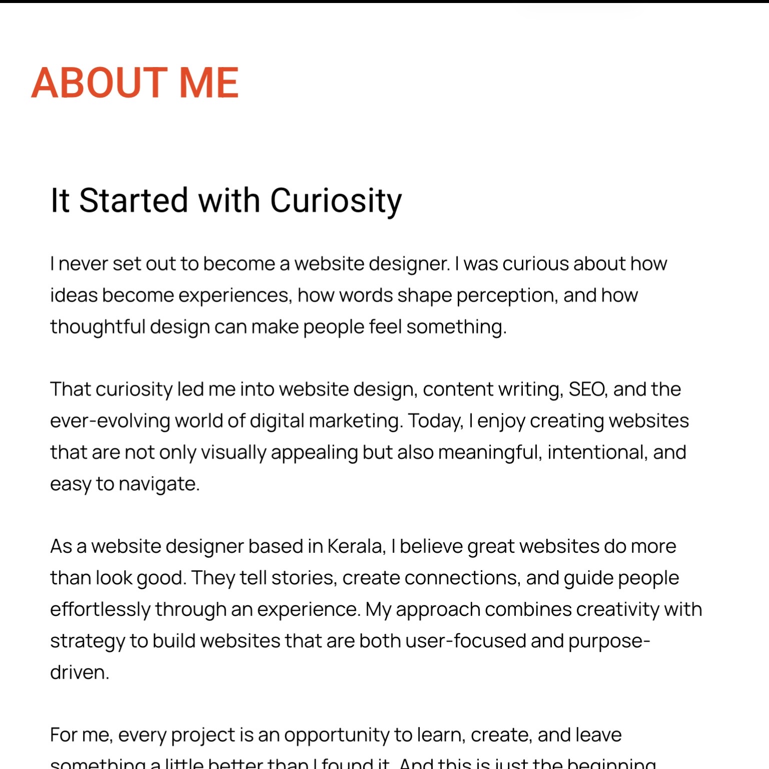
Generous White Space

Generous white space was used throughout the website to improve readability and create a calm, uncluttered experience. It allows each section to breathe, making the content easier to navigate and giving greater emphasis to important elements.

LOOKING BACK

This project began as a simple idea but quickly became one of my biggest learning experiences. From questioning design decisions to completely changing directions midway, every challenge taught me something new about design, storytelling, and myself. Looking back, I’m proud not because everything was perfect, but because I created something that genuinely feels like me. As I continue learning and growing in digital marketing, this portfolio will grow with me, and I can’t wait to see where it takes me.

“This isn’t the final version of my portfolio. It’s the first chapter of my journey.”

Note: This case study documents the first version of my portfolio website. As I continue learning and growing as a website designer, the website will naturally evolve. This case study captures the research, design process, and decisions behind its initial version.

Ready for the next project? 

Brewing a Better Digital Experience.

Scroll to Top